Datakeeper
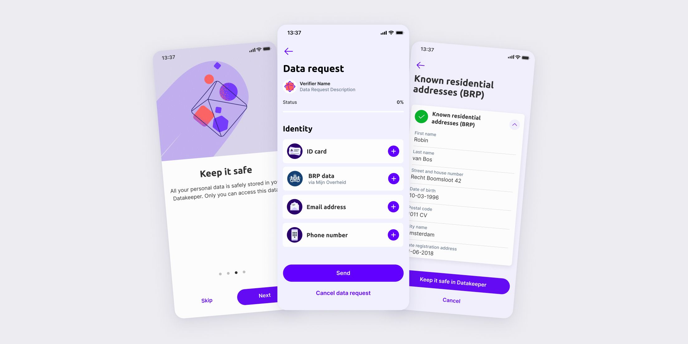
Datakeeper is a Dutch digital identity app, initially powered by Rabobank. It lets people share their personal data with organizations in a way that’s fast, safe, and consensual. Data is never on the cloud and users always see what information will be shared before submitting it.
Instead of emailing payslips and copies of a passport, or struggling to find the right website to retrieve the relevant info, customers pull verified data straight from sources like the Belastingdienst, UWV, or their bank.
Once they have the information needed for the request, users just share it with a few taps. Companies use it for things like ID checks, age verification, KYC, and financial checks. Only the data that’s actually needed gets shared, and sometimes the data is minimised to meet business criteria and will just say YES or NO.
The challenge
Datakeeper is the bridge between brand and consumer. Companies create the data request, Datakeeper retrieves the info and validates it, and the user sends the data through an encrypted channel. In many scenarios this submission means handing over very sensitive data: Financial history, registered addresses, or legal documents.
Since there had been barely any research carried out, we pulled up backend data and discovered an uncomfortable truth. Almost half of the people who started a data request never finished it. App store reviews were giving us a pretty low rating, but at least gave us a clue about where the smoke was coming from.
Here is what we wanted to achieve. Time to go back to the drawing board!
Research
The starting point was a quick sanity check to evaluate our current situation. We hosted a workshop where we mapped out Datakeeper’s guiding principles (Simplicity, Trust, Performance, Safety, Transparency, and Design) and scored ourselves against them internally. Then we put those scores to the test.
We ran a moderated usability study with 24 participants using a house rental scenario. They followed a task, filled in a score card and then had an interview regarding their experience with the data request and what influenced their rating.
Since we wanted a significant sample size and resources were limited, we gathered 2/3 of our respondents from different departments in-house. For the rest we worked with Norstat to make sure we had a decent mixed bag. We tested with people aged 21 to 65 from different backgrounds, with accounts in different banks. This was relevant because Rabobank was backing up the project and we wanted to see what type of influence it had on the users.
Pulling verified data from official sources had a technical constraint with no workaround. It could not be done through the DigiD App (which is the process users are familiar with) it had to be done using login credentials. In order to remove friction, we provided the respondents with a passport and DigiD credentials (mine, because I like to live my life dangerously).
We asked respondents to walk us through what they were doing throughout the journey and what were their thoughts at every step. Even though they were not using their personal data, many of them reacted in a similar way when DigiD credentials were requested.
“Why the hell am I suddenly on a Government login screen in the middle of a private task?”
What was meant to be a safety feature was identified as a red flag, not a safeguard. Despite those remarks, the overall rating was good. As expected, the score was a bit lower than our self-evaluation, which is always a good reality check (and a great tool to get stakeholders to allocate more resources to research).
When we got to the interview part we started exploring the different topics and added extra pressure to the lowest-scoring items. That is how we confirmed trust and security were the weakest links. Still, the results were not as rough as we expected based on the user feedback on the app stores.
We decided to do one last round of interviews, but this time it would be an unmoderated usability study with 6 respondents. The structure would be the same, but we tried to replicate the real settings as much as possible. Users would have to use their own data this time. No external help and no credentials or passport provided. After the study we would run a focus group with the same people.
This time we hit the nail on the head! Half of the respondents refused to import their documents or submit the data request. This was the most useful moment in the study since the rating suddenly dropped from 6.5 to 4. It confirmed the flow wasn’t losing people to confusion but to fear.
Insights
Once we transcribed all the data from the interviews and the focus group, the themes started surfacing on their own and we started getting a better picture of the whole problem.
We were able to retrieve a lot of good insights on a lot of different areas (this case study focuses on trust, but since our resources were limited, we tried to gather as much info as possible). These are the main insights from the research sessions regarding trust.
Congrats for making it this far into the case study, I appreciate you taking the time to read through it! Now it’s time to put all those findings to work and come up with some solutions!
Design
Turns out the hard part wasn’t designing a better flow but designing around the constraints we couldn’t control. DigiD wasn’t going away any time soon and wiring it through the app was not possible.
The work became all about context. We told people where their data was going, how it would be retrieved, and why. All before they hit the moment that caused everyone to panic. The first point of contact was the data request screen, so that is where we started priming the user for the journey ahead.
For the data point screens we tightened the visual design so the whole thing was more intentional. The data source was highlighted, the illustrations were refined for better and faster scanning, callouts with instructions were incorporated, and we made sure that DigiD had more presence in the screen, so it would be very hard to miss. Now the redirect was read as intentional, not an unexplained detour.
Lastly, we adjusted the nature of the content of the FAQ accordions. Instead of generic information about how data points are retrieved, we madre sure to explain in detail why DigiD was needed, who could access the data, and more importantly, which information was retrieved.
Measuring
Everything was in place! Now we just needed one last thing. A quantitative research plan to check the pulse and hear back from the users. We decided to implement short user surveys with GetFeedback right after the data request was completed. This is where the source would be optimal.
We also created a rule to trigger the form again for users who had submitted more than 3 data requests. Data requests are not that common, so this pattern was a bit of an edge case, but it would allow us to see if there were any noticeable changes.
Outcome
The numbers moved on both ends. Average app store rating (combining Apple and Android stores), went up from 3.2 to 4.6.
Conversion (finished data requests) went from 56% to 82% by our last quarterly measurement.