APC Bank
APC Bank is what happens when a pension fund decides an island needs a modern bank.
Three institutions were being folded into one: PSB Bank, which most people on Curaçao still knew as the post office savings bank, the Central Mortgage Bank, and the original APC Bank. A digital bank was to be built alongside the merger.
Curaçao came late to digital banking, and that shaped everything. Visiting a branch was still the normal way to bank, and a meaningful share of the new customer base was inheriting its relationship from a post office savings tradition. We were not redesigning how people banked digitally. For a lot of them, we were introducing it.
The scope was the full digital proposition. Accounts, cards, savings and payments, plus SME banking for business customers, across web and mobile. Two designers, four to five months.
The problem
The romantic version of this project is the blank page. Brand new bank, no legacy product, every decision the first of its kind. The reality was less romantic and far more interesting.
The bank ran on Temenos, a core banking platform with strong opinions about what a bank is allowed to be. Between us and that platform sat the implementation partner actually building it, with their own delivery templates, their own legacy screens, and their own deadlines.
The partner mattered more than the platform. Temenos set what was possible; the partner set what was available. A design decision did not travel from us to the build, it travelled to a company with its own deadlines and no particular incentive to reopen something already templated. Plenty of what we designed had to be won twice, once on merit and once on whether anyone would build it.
The brand already existed too. It had been settled before the product work started, along with a UI kit, so the visual language was a given rather than a question.
So a real share of the design work was archaeology. Going through screens and components that already existed, working out which ones reflected an actual product decision and which ones were just defaults nobody had ever questioned, then negotiating what was still open.
Not a blank page. More like a page someone else had already started writing on, in pencil, without telling us what the story was.
Research
Here is the part that shaped everything else. There was no research on this project, and there was never going to be any.
The client was a brand new bank staffed by people who knew banking deeply as a branch business. They did not yet know what they wanted the digital product to be, and asking them directly got us nowhere. “What should this do?” returns silence when nobody has decided yet.
So we stopped asking and started proposing. It was never a formal workshop programme. It was a habit we fell into and then kept on purpose: never take an open question back to the client, take three answers instead. Here are three ways established banks handle this. Here is what each one costs you. Which one sounds like you?
Nobody in those rooms could answer “what should this do”. Everybody could answer “not that one”.
That made desk research our stand-in for discovery. Not equivalent, and I am not going to pretend otherwise, but conventions carry borrowed evidence. A pattern that every Dutch bank has converged on has been tested against more customers than we could ever have recruited.
The clearest example was savings. The client could not produce a structure that held together, the drafts came back confusing, and several rounds of comments did not fix it. The work stopped. This is what a skipped analysis stage actually costs you: the problem does not disappear, it just surfaces later, in the design stage, where it blocks everything behind it.
It was my colleague who took it apart. They researched how the large Dutch banks handle the same products and built a clear visual comparison, which let the client see for themselves why their own scheme did not work. From that point it moved. Not because we argued better, but because the comparison made the problem visible.
With no product manager in the room, every design review secretly becomes a product decision.
That was the operating mode of the whole project. Design work that was quietly product work, done because the alternative was building the confusion exactly as specified.
Design
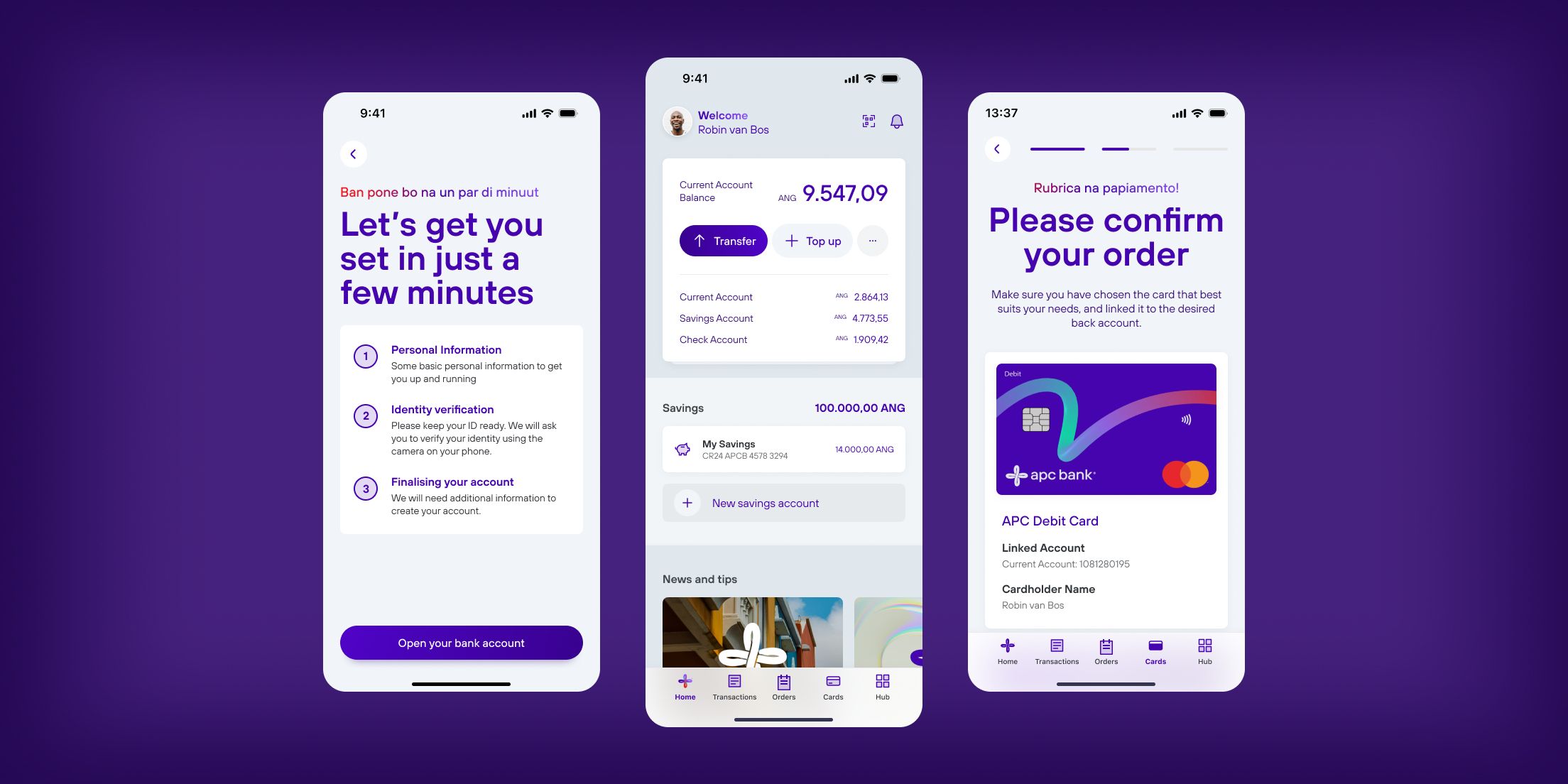
We divided the surface. My colleague took messaging and notifications end to end. I took the account model, onboarding, cards, and everything where money moves. The home page, savings and SME we worked on together, because each of them reached into both halves.
Structure came first, because everything else hangs off it. We started deliberately small: a limited set of account types and the functions a customer actually reaches for, rather than everything the platform could express. A first digital bank does not need to be complete. It needs to be legible on the first visit.
Then the flows where a mistake is expensive. Onboarding and identity, cards, transfers and recurring payments. Those stayed in my own files, because in a bank the risky screens are the ones where an error costs someone money or locks them out of their own account.
All of it was drawn for a customer whose mental model of a bank is a counter and a passbook. That pushed the work toward being explicit rather than clever: fewer gestures, more labels, and language that does not assume you know what a standing order is.
Every flow got a plain overview before anything was committed, and a way out at every step. Someone doing this for the first time needs to be able to back out without feeling they have broken something.
Inherited SME
Business banking ran on Temenos and largely already existed. The client asked us to work out whether the flow was actually viable.
Not really, was the answer. We audited it and wrote up what was wrong: logical gaps in the flows, and an interface far more complicated than the four jobs it had to do, which were signatory groups, approvals, user management and bulk payments.
Then we hit the real constraint. Restructuring it would have taken time and budget that did not exist. So we did the part that was available: a UI revamp on the APC kit, so it read as one product with the rest of the bank, plus a written record of the structural problems we were not able to touch.
That is an unsatisfying outcome and I would rather say so than dress it up. We fixed the layer we were allowed to fix, and plenty underneath it stayed broken. The audit is probably the more valuable artefact, because it named the problems for whoever gets the budget next.
Army of two
My role, on paper, was lead product designer. In practice it split three ways. Setting direction and keeping a two person team coherent, driving the conversations with the bank’s stakeholders, and staying in the actual files on the flows that mattered most.
Leading a team of two is its own discipline. There is no room for management theatre. Every hour I spent coordinating was an hour not spent designing, so the coordination had to earn its place.
What worked was dividing the surface rather than the process. Clear ownership of areas, shared ownership of the system underneath them, and a standing agreement to pull each other in the moment a problem turned out to be bigger than a screen. The areas we shared, savings and SME in particular, were the ones where that agreement earned its keep.
Handover
We designed the bank, handed it to the third party vendor building it, and our engagement ended, so we never saw it launch (but we know it’s up and running).
So this case study does not have the section you are expecting. There is no adoption curve, no completion rate, no app store rating climbing from one number to a better one. I can tell you what we designed and why we designed it that way. I cannot tell you what it did in the market, because I was not there when it met its first customer.
That is far more common in agency work than portfolios like to admit. The honest version is that the work left our hands in good shape and I do not have any backup data.
Learning
We adapted to the lack of structure instead of imposing it.
With no product manager and a client still working out what they wanted, staying flexible felt like the professional move. It was the weaker one. Every shifted goal cost design time we never got back, and the flexibility we offered read as spare capacity rather than as cost. It quietly became the flexibility that was expected.
If I ran it again I would name the vacuum in week one. This project has no product owner, so here is the structure design is going to impose: a decision log, a change process, and boundaries on what a sprint absorbs.
Nobody would have objected. Nobody objects to structure. They just never volunteer to build it.
Structure, it turns out, is also a design deliverable.